Sign Up For Newsletters

Subscribe

* indicates required

Tuesday, March 29, 2016

Working on My Roses

 I was really struggling with my Trader Joe's roses.  I just struggled so much with my last two paintings with the roses that were in it.  I just feel like I need to hanker down and focus on the one rose.  I am excited to try this out.  It's better to improve when you focus on little things like that.

I'm excited to do this blue vase.  I bought this blue vase at Target so that I could practice painting it.  Looks so great!
This is a 15 minute session.  I'm only doing 15 minutes sessions right now because my neck has been bugging me.  Sometimes I don't realize how long I have been painting, and it's just hard to limit myself. I just tend to push myself as far as my body can handle in all areas of my life it seems.  I have been learning the hard way this year how to cut back in all areas of my life because I push myself too hard.  Isn't that crazy?  It is so hard for me to not do things sometimes.
 The bottom picture is the final. I actually like the version right about me better.  This is an excellent example of overworking a painting.  I especially love the vase up above. The one at the bottom lost it's freshness and I added too much color.  But I do enjoy the final product.  I used it as a wedding gift.


Saturday, March 26, 2016

Red apple Study #1


 I'm still no pro at painting and maybe never will be, but I definitely felt like I was sculpting this apple.  It started out looking really weird as I tried putting in some values.  But in my next 15 minute session, I got what you see in the next picture.


Here is the final.  I felt like that was good enough for the study to be complete.  I love the apple.  I don't love the dark blue table as much as the lighter white.  I think I will do another apple study.  I also want to do a study of that blue vase I did with a rose recently.  This was great practice.

Monday, March 14, 2016

"Blue Mystery", 2nd attempt at Trader Joe's Still Life Flowers

This painting is called "Blue Mystery."  I just find it really romantic, and very pretty.  It is very textured.  It has a thick underpainting, so it really has some body to it.  I really loved how this blue dark background turned out.  I'm really starting to appreciate how much a real painting can't quite be duplicated.  Original paintings have a special color hue and feel that cannot be achieved by a reproduction.  

The color scheme with a dark background with these flowers just seemed very classic, and mysterious.  The emphasis wasn't on the flowers necessarily.  I'm glad that I toned down the color of the flowers.  I didn't every bring out that much pink in one of the main flowers, and that was a great decision.  

I'm learning that pink is a really strange color and demands a lot of delicacy, and proper use or it looks so PINK.  Flowers are pink, but have a lot of orange and yellow, even green in them.  I'm learning to make better decisions on what to start as the first layer of a flower petal.  I watched a tutorial where they used yellow and layers pink on top.  That seemed to be what I needed!  So I started all of these flowers with a yellow white, and I thought that the overall look was much better than my first attempt with these flowers (previous post.)
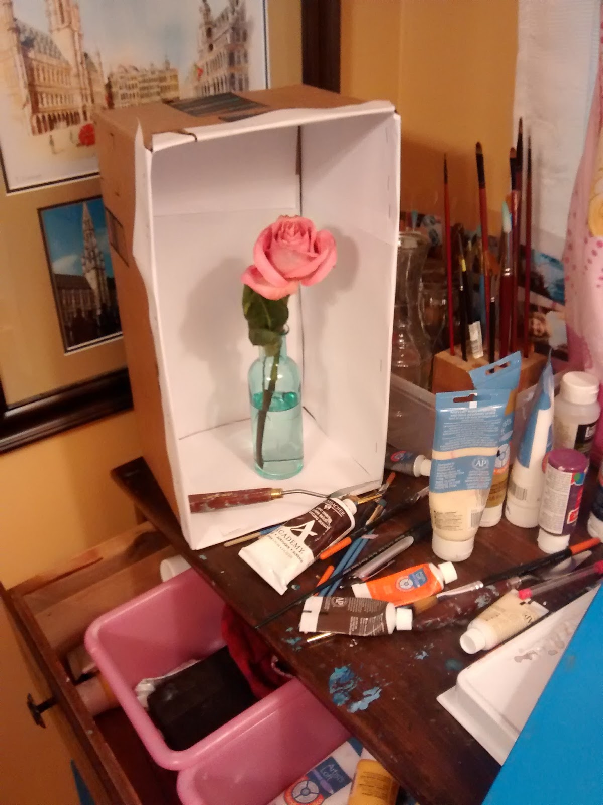
I have to draw it out and center it.


Improved rose on the left, though needs improvement

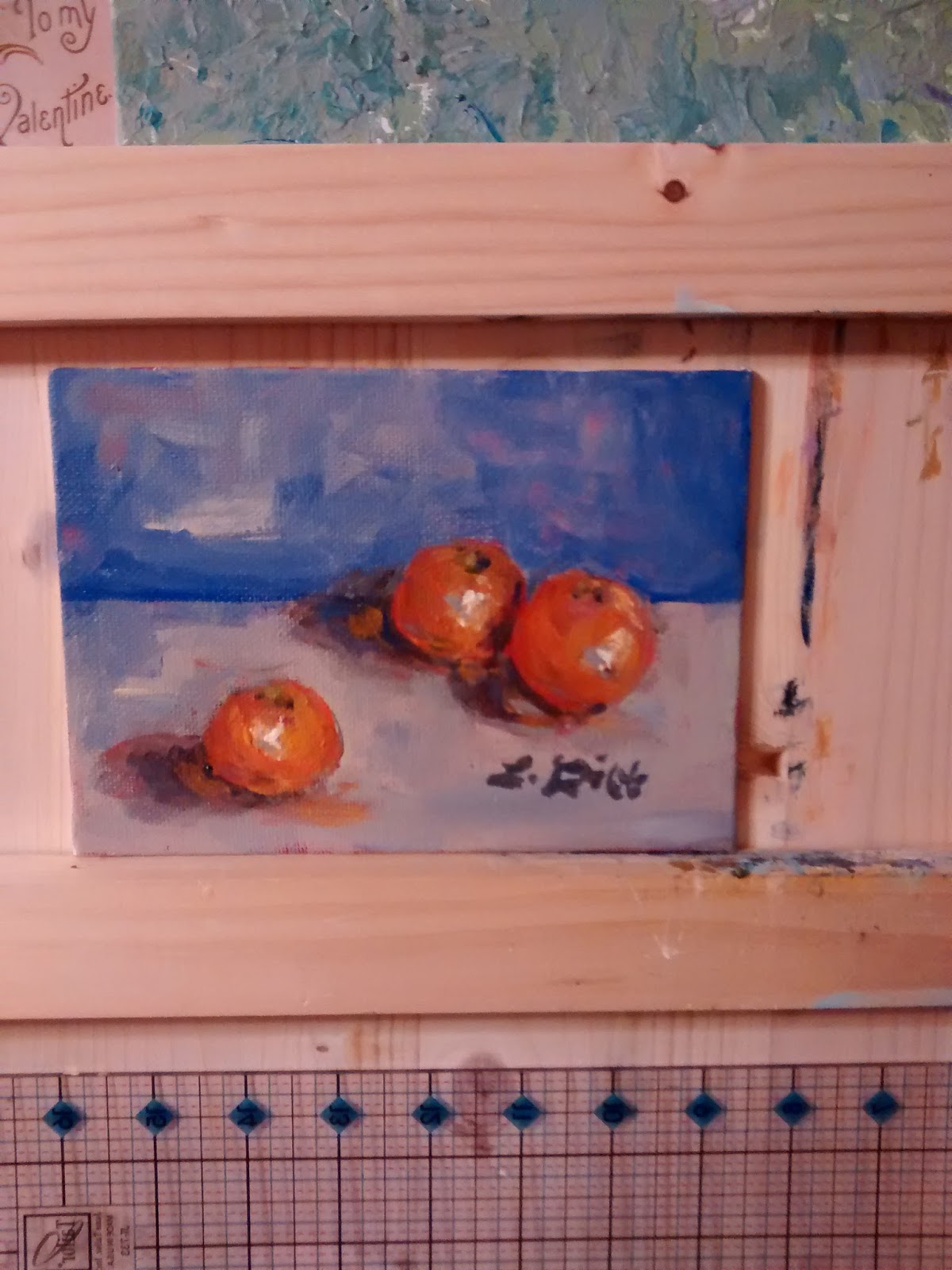
See the flowers and the painting.

I think the vase is always my favorite part at the end.


Thursday, March 10, 2016

1st Attempt Trader Joe's Still life flowers, "Pink flowers."

Here is a still life of flowers I was practicing.  I actually really struggled with these flowers.  Like really struggled.  It's a 5X7, and I really needed to draw it out better.  It was great practice.  I was trying to follow techniques I watched in a youtube video, Alla Prima, and it just wasn't working.  I wasn't skillful enough for Alla Prima, which is layering really thick paint and using wet paint to move around and create what you want.  I just needed to paint it and not try a method like that.


The shapes of the flowers could have been much improved.  I think it's cute though.


Thursday, March 3, 2016

"Cobalt in Bloom"

This is a commission.  The requests were: cobalt color, not too detailed, white background, flowers (didn't matter which kind,) large in scale, emerald green.  These colors are supposed to go with the house decor of this client.  It worked out well, and the client is happy!  That's always the best.
Wayne helped me with this painting.  I let him do some of the underpainting, and so did Miranda.  So we did yellow underpainting, and then a bluish light white sky with yellow in it on top. 


I really loved these at this phase, but I needed to add some more to the left to balance the painting.


I have to say, that it looks better in person.  The colors are more lively, and there are more layers.  I lightened up the painting and worked to cover up some of the buds so it wasn't so overwhelming.  The owner loves it, so I'm so pleased!